Brand Assets
The mark
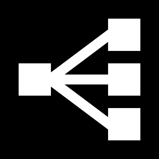
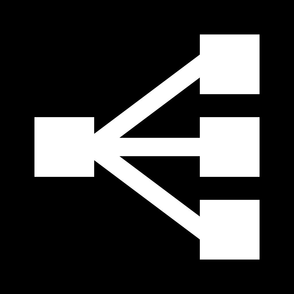
The FreeRouter mark is a routing node: one entry on the left fanning out to three exits on the right. Use the dark glyph on light backgrounds, the white glyph on dark ones, and never anything else.

The wordmark
FREEROUTER is always set in Krona One, all caps, letterspaced. The lockup pairs the mark with the wordmark — use it when the name appears alongside the logo, e.g. partner pages and press headers.














SVG wordmarks need the font
The SVG lockups reference Krona One by name — install it (free, Google Fonts) or the text falls back to a system sans. The PNGs are pre-rendered with the real font, so they always look right.
Clear space and minimum size
- Leave clear space on all sides at least as wide as one square of the mark — nothing (type, rules, page edges) may enter it.
- Minimum sizes: mark 16px, wordmark lockup 96px wide. Below that, use the mark alone.
Colors
Three colors, no gradients:
#0F0F0F— FreeRouter Ink. The glyph on light backgrounds; primary text.#FFFFFF— FreeRouter Paper. The glyph on dark backgrounds; page ground in light mode.#808080— FreeRouter Gray. Secondary text and UI accents only — never the logo.
Type
- Headlines and the wordmark — Krona One.
- Body and UI — Instrument Sans.
Ground rules
- Don't recolor the mark, add gradients, shadows, or outlines.
- Don't stretch, rotate, rearrange, or re-set the wordmark in another typeface.
- Don't place the dark glyph on dark backgrounds (or the white glyph on light ones).
- Don't imply endorsement or partnership beyond the facts — "works with FreeRouter" is fine when it does.